 Ok critique
 three went a little better. I am getting closer to something good. Photography is a struggle for me, but it gets better as the semester goes on. These images are similar to last weeks, but more specific. After critique the
subtle images still work best (the add with the man on his knees). There was text with all these images, but in class we decided it best to go with out. That the images should be strong enough to stand alone, and still get the point across. The text may just be distracting/
un-needed. I still want to
mimic ads I see that are highly gender based, and swap the sexes....But it will be more
subtle. Ads will be my inspiration. This project has is based on feminism and the
sexist society we live in. From this series the GAP image was not strong enough in getting my point across. The shoe add is an interesting take on it, but the full layout of the man on his knees and the placement of the figures works best. Something is happening in the watch add with the female and the viewer. So I need to play with that more. I want her to look empowering (like the male did from the original add). For my next series of images I hope to go off this
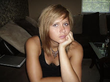
pictuer. Focus on bodies,
adorning, and how the people are presented.


 Ok critique three went a little better. I am getting closer to something good. Photography is a struggle for me, but it gets better as the semester goes on. These images are similar to last weeks, but more specific. After critique the subtle images still work best (the add with the man on his knees). There was text with all these images, but in class we decided it best to go with out. That the images should be strong enough to stand alone, and still get the point across. The text may just be distracting/un-needed. I still want to mimic ads I see that are highly gender based, and swap the sexes....But it will be more subtle. Ads will be my inspiration. This project has is based on feminism and the sexist society we live in. From this series the GAP image was not strong enough in getting my point across. The shoe add is an interesting take on it, but the full layout of the man on his knees and the placement of the figures works best. Something is happening in the watch add with the female and the viewer. So I need to play with that more. I want her to look empowering (like the male did from the original add). For my next series of images I hope to go off this pictuer. Focus on bodies, adorning, and how the people are presented.


No comments:
Post a Comment