In my work, I reference magazine advertisements and alter the stylization of gender to explore the emotional and psychological effects it can have on my viewer. I take existing imagery, and switch the subject’s gender. This concept is subtle, but once it is recognized the image is read very differently.
The series is framed around the concepts of gender and oppression that form a part of our popular cultural landscape. I call attention to these issues by focusing on gender identity within my imagery. I transform gender roles through the acts of my models, and force the viewer to think about the often opposing view of the male and female body in mass media and in society.
This is in conversation with the trend of other advertisement/fashion images that challenge preconceived ideas of gender roles. Except I use strange non-scenarios to reference the tropes of fashion and deal with gender stereotyping, but without my images reading as a specific advertisement.
My inspiration comes from our cultures view that “sex sells,” which often leads to a forced connection between a sexualized female figure and a product being marketed. This is the crux of my series, but I exploit the male figure in my work in hope that these disempowering images make the viewer ask “what is this trying to tell me.” The same response I have when looking at the oppressive ads I am referencing. I hope this series makes the viewer walk away not only more aware of gender representation in advertisements, but also their own gender role in society.
Monday, November 29, 2010


Tuesday, November 16, 2010
Art photography after Photography (just the intro had be asking questions)
Does art photography have to be pushed to perfection in "performance, conceptual, critical, and directorial strategies" so it can be considered fine art? To stand apart from the mediums use in everyday society. ..
Personally I was unaware of how far photography can be pushed (narrative, fantasy, performance, history, memory,identity) and even do a better job than other "fine art" mediums. Before this class I had an under appreciation for digital photography. I wonder how many others do to, and how this can be changed?
I have a better understanding of postmodernism photography. But the question I left with: " What do images refer to based on how their put together" ....what is past the surface?
Monday, November 15, 2010
After last Critique
My artwork being focused on gender roles is still there. I am getting closer to why I am drawn to this subject matter, and why I create the images I do. I mimic high fashion magazines so my viewers have a reference point with my work. They recognize the formal elements of my photos and a familiarity with them, but are still questionable on what they are seeing. After further investigation of the image the viewer realizes how the gender roles of our society have been switched, and than read the image completely different. I chose this technique because images surround us everyday and it was a way to connect with my audience in a subtle way. This is why my images will be sized like that of a magazine page. By referencing fashion magazines, a product predominately bought by females, I am pointing out how woman are still being portrayed negatively. And accept it as the social norm.
The concept of gender and oppression of woman in our cultural landscape is a complex issue. It has been tackled by many before me, but I am trying to find my voice in the issue. The ability to use photography to draw my viewer in, and than confuse them by the subtle difference of having a strong woman in the image is shocking to me. When as a culture we are so numb to seeing males as the dominant sex.
How I compose these images are still a struggle. I am getting closer and have some really strong ones, but still need more. The compositions where scenarios take place between the male and female work best. The female needs to be dominant, strong, independent, but done in a positive manner. I want this to come across as normal and common. I pay attention to details (nail polish, back muscles, clothing, color, stances) and do not like being forward. That is boring, but some of my images do have humor. Another device I use to tackle a serious topic. The repetative use of the same to models, and the lack of facial exposure helps my series flow.
Thursday, November 11, 2010
Quiz 3

Make a posting to your blog reflecting upon the artists/ideas presented in your textbook, and surrounding discussions. Summarize the content that was of most interest to you and/or most relevant to your own studio work – the posting should include at least two images.
I found Rinko Kawauchi’s discussion part in the book of interest. It speaks about how important editing and sequence are with a body of work. My camera is not the best quality and when dealing with a modest set of production it even enhances the selections made. It should be able to tell a narrative with no aiding text. The viewer should be fully nourished after. I need to work on this, but not overcomplicate things.
I also really liked An-My le. This is when I really realized that although we live in a digitized world, the process of photography is very important. The material and physical aspect, because it can alter and direct the way a viewer interprets an image. It helps us remember/learn about t he past, and expand on contemporary photography today. I like her link to historical landscape images of war and the aestheticization while drawing attention to the lack of contemporary depiction today. I had never thought of using an historical style to get at a contemporary message. This is a technique I can use in my senior study. I am working on the issue of our current economic issues, but exploring how to do this in a historical style relative to times of other economic downfalls is inspiring.
I found Rinko Kawauchi’s discussion part in the book of interest. It speaks about how important editing and sequence are with a body of work. My camera is not the best quality and when dealing with a modest set of production it even enhances the selections made. It should be able to tell a narrative with no aiding text. The viewer should be fully nourished after. I need to work on this, but not overcomplicate things.
I also really liked An-My le. This is when I really realized that although we live in a digitized world, the process of photography is very important. The material and physical aspect, because it can alter and direct the way a viewer interprets an image. It helps us remember/learn about t
 he past, and expand on contemporary photography today. I like her link to historical landscape images of war and the aestheticization while drawing attention to the lack of contemporary depiction today. I had never thought of using an historical style to get at a contemporary message. This is a technique I can use in my senior study. I am working on the issue of our current economic issues, but exploring how to do this in a historical style relative to times of other economic downfalls is inspiring.
 Wednesday, November 10, 2010


Thursday, October 28, 2010


Crit 3
 Ok critique three went a little better. I am getting closer to something good. Photography is a struggle for me, but it gets better as the semester goes on. These images are similar to last weeks, but more specific. After critique the subtle images still work best (the add with the man on his knees). There was text with all these images, but in class we decided it best to go with out. That the images should be strong enough to stand alone, and still get the point across. The text may just be distracting/un-needed. I still want to mimic ads I see that are highly gender based, and swap the sexes....But it will be more subtle. Ads will be my inspiration. This project has is based on feminism and the sexist society we live in. From this series the GAP image was not strong enough in getting my point across. The shoe add is an interesting take on it, but the full layout of the man on his knees and the placement of the figures works best. Something is happening in the watch add with the female and the viewer. So I need to play with that more. I want her to look empowering (like the male did from the original add). For my next series of images I hope to go off this pictuer. Focus on bodies, adorning, and how the people are presented.


Tuesday, October 5, 2010
Crit #2
For this Critique I was better able to get a grasp on what I am trying to do. Mimicking magazine adds I am emphasizing the role gender takes on in society. It is no secret that females are degraded and sexualized in advertisement. I am taking these roles and flip-flopping them. For this series I took popular magazines or products and changed the gender of the model. I wanted to play with the way the viewer reacted to this difference. How uncomfortable they would feel by these images. They are in complete contrast of the images we have been brought up viewing on tv and magazines. After class the more suttle adds seemed to work best. For example the tommy hillfigure. I think with this round I used too much text.


Sunday, October 3, 2010
Erwin Wurm Photographer/Sculptor

Erwin Wurms work is “generally accessible on a primary level.” His goal is to reach as many people as he can, no matter their status. He gets his inspiration from referencing comic strips, quotes, and science fiction movies. His work reveals the darker side of human nature. To quote him: “I am interested in how people see themselves compared to the greater world as a whole.” He feels truths about society and human existence can be explored in different ways than just serious. This is why he uses humor in his work. It is a lighter way to explore these issues. By doing this he is mocking those in power who see themselves too seriously.
 He is well known for his series “One Minute Sculptures." These series give written instructions and props for people to carry out,
  which are then photographed or taped. The picture of the old man with utensils coming from his face, the man against the wall, and the two women are from this series. These are big one on audience participation, and encourages everyone to be a piece of art.
Erwin likes to create powerful images that are clear and to the point. The impact is direct. His images also deal with icons of our time and society. These following pictures are example of how in your face and aggressive he is. The two with the man are sexual. They are using fruit in the place of human part s. This adds a comical feel, but the pictures are blunt. The man does not look happy, but the viewer is questioning why he has fruit in those places.
 s. This adds a comical feel, but the pictures are blunt. The man does not look happy, but the viewer is questioning why he has fruit in those places.
 The "Artist begging for Mercy" does not make the artist look like the good guy. He is dressed in black and on his knees. The yellow (lemon?) in his mouth draws the viewers eyes to the spark of color.
"Outdoor sculpture
 Cahors" is a great example of Wurm's work. By capturing a gesture that only lasts for a second in time, Wurm makes it a lasting piece of work, while making the human body the material. By using only a body and a wall, Wurm showcases interactions in the world, waiting to be discovered.
"Instructions on How to Be Politically Incorrect" is some of my favorite work by him. How odd the images are make it hard for me to look away.
The first two he has created scenarios where people are looking for bombs in unlikely places. For me this relates to how our society reacted after 9/11. This is a serious topic, but again he has done it by humor. Formally I like these pictures too. The people look unaware of the camera, but we know these are staged. Their faces are serious, annoyed, but the pictures are
 still comical. The colors are neutral and the settings are all social places. The natural
  daylight works well for a realistic tone.
The one of the man with his pants down is "Fuck the 3rd World." I was surprised when I read this title. The image looks juvenile or some prank being played out. But the angle of the shot draws the viewers eyes down the wall and to the man. The man is white and older hanging onto an old, worn out wall. This shows the white man demoralizing the wall. This image is pushing the limits to what is humour or crossing the line.

I love this photo. The young girl slurps over a friends soup (Which we all know is inappropriate). The look in her eye is mischievous. The colors are vibrant, and the scene looks like it could really be happening. The girl is crossing the line, but yet the image is still playful.
As for materials he uses everything around him. Anything or person can be his subject matter. This helps him explore contemporary society. He likes to explore the whole entity of the human (spiritual, physical, physiological and political). Sarcasm and humor are his tools to do this,he still pays attention to formal elements (color, composition, form). According to Art in America he is a minimalist but pays “homage to artist traditions by undermining them” (Cash 86). There is something interesting how he gets the viewer to interact with his objects. There is also a fascination with how many people are willing to participate.He has done a great job exploring the interaction between drawing and performance.
Changes the way we look and interact with everyday objects.
As for his body of work: Objects in his earlier pieces dealt with more permanent instillation's with things like dust, furniture, and clothing. His more recent pieces involve photo and video. His photos range from all sizes. From smaller ones in installations to large ones blown up to life-size on the wall. The large size shows power. According to Glen, “The latter position is as intimate as it is uncomfortable” Wurm’s work generally exists in a zone where seemingly playful explorations occur within strictly prescribed parameters” (Glen 187).
Images copy write: "artnet" and "picsearch"
Tuesday, September 21, 2010
Images Crit. #1


Here I wanted to play with assumptions. How we automatically read the girl as the victim. Both figures have bruses/cute, but we link the male as the abuser. This flows with the male dominated societt. Also that this is a big issue between the sexes. I was thinking of keeping these images, and then adding ones where the male is the victim?


These images:
The top left is dealing with the stereotype that everyone women loved chocolate.
The left is automatically assumed this is an action a female is doing. Reading a "girl" magazine, maybe laying out. (although not enough information is given to fully know). Society has trained my viewers to interpret the image this way.
The left of a large, male cleaning was done to as the swapping of gender roles. I wanted to see if this difference affected the viewer.
Images


Monday, September 20, 2010
Where I am at on Critique #1
-What was Initial Ideal?: “If Women Ruled the World.”
Swap gender roles.
Or (and leaning more towards) and evolving to…
Explored male dominance over women. dominant males have become in society by taking pictures of everyday acts (like opening the door, paying the bill, driving the car) I want this to convey emotion and the relationship between men and women.
New Ideas: We live in a male dominated society. I want to visually represent this through pictures.
Why do some images strike you differently as a viewer?
Sexual representation
Stereotypes
Identity
Abuse
Body Language
-What does work communicate to viewer?
Gender representation. Explore roles of men and women visually.
-What is working well, what change or improve?
I like the different emotions, but I need to focus my project more. It is still broad, but the more images I take will help this.
Power to attract others?
Domesticity (influence of home life)
Power (ability to have strength, influence and/or control) Who is the victim?
I like this term:
Patriarchy is a social system in which the role of the father is central to social organization, and where fathers hold authority over women, children and property. Historically, the principle of patriarchy has been basic to the social, legal, political and economic organization in Hebrew, Greek, Roman, Indian and Chinese cultures, and has had a deep influence on most aspects of modern civilization.[1]
In feminist theory the concept patriarchy often includes all the social mechanisms that reproduces and exerts male dominance over women.
Project Purposal
Initia Idea?
For my project I want to explore the ideal “If Women Ruled the World.” I have always taken an interest in art that explored male dominance over women. I want to start incorporating this into my own work, and I feel this concept would be captured best be photography. I plan on creating a series of photographic prints, and giving them a specific order.
Ideas I currently have are broad, but to start I will swap gender roles. I hope to capture how dominant males have become in society by taking pictures of everyday acts (like opening the door, paying the bill, driving the car), but doing a role reversal. I will also explore this topic with some comedy (like a toilet seat chained down to the floor). As of now these images will be from a feminist point of view. Although, I will want to also see how images from the man’s point of view will turn out. I plan to experiment with various elements, depending on the scene I am shooting. Color will be a big factor to this project too. I want this to help convey emotion and the relationship between men and women.
Saturday, April 24, 2010
Looking Back
This course went so fast, but it was a lot of fun. I was nervous at the first class because I knew nothing about photography or Aphasia. As an art major I knew I would catch on fast, but with the help of the teachers ability to break down photography and meeting those with Aphasia (All nerves were GONE). From there the course was very rewarding. I learned a new medium which I now love, and also was given the chance to help others along the way.
This was a great class environment and place to learn. Everyone in the class became close, and this made class discussions very productive. I learned a lot during this course, and also grew a desire to want to help others. I realized art is very therapeutic.
I feel like this class affected everyone that took apart in it. It was a very positive experience and I want to keep participating in a service-learning environment. I also became very comfortable with the camera and grew more confidant in my photographic abilities. I also learned about Aphasia and all the work that goes into being a stroke survivor. Something I knew nothing about to start.
Wednesday, April 21, 2010
Final Project
Final Project!


My new site!
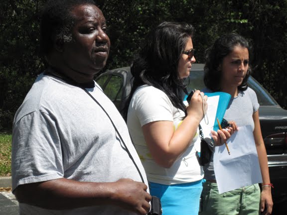
For my final project I decided to do a website. It was a fun, creative way to share my experience with the world. “The Photography as Language” was my first service-learning class, and I wanted a way to convey is affect on me with other. I also wanted to share the information I learned.
The hardest thing with this site was to make it Aphasia friendly. I used a lot of white space, few colors, and large text. I also use images of the participants in the program so viewers can connect more to the cause and information given. Overall this site was difficult for me to create. I had to make sure not to make it complicated or busy.
The site includes a home page wish described what the site was. The next page included information on Aphasia. The class page included information on the service-learning class and what took place during “The Photography as Language.” There is also a page for guests to learn about photography so they can start taking their own images, and lastly a links page.
Overall I am happy I decided to do this as my final project!! Hope you enjoy it too J
Subscribe to:
Comments (Atom)